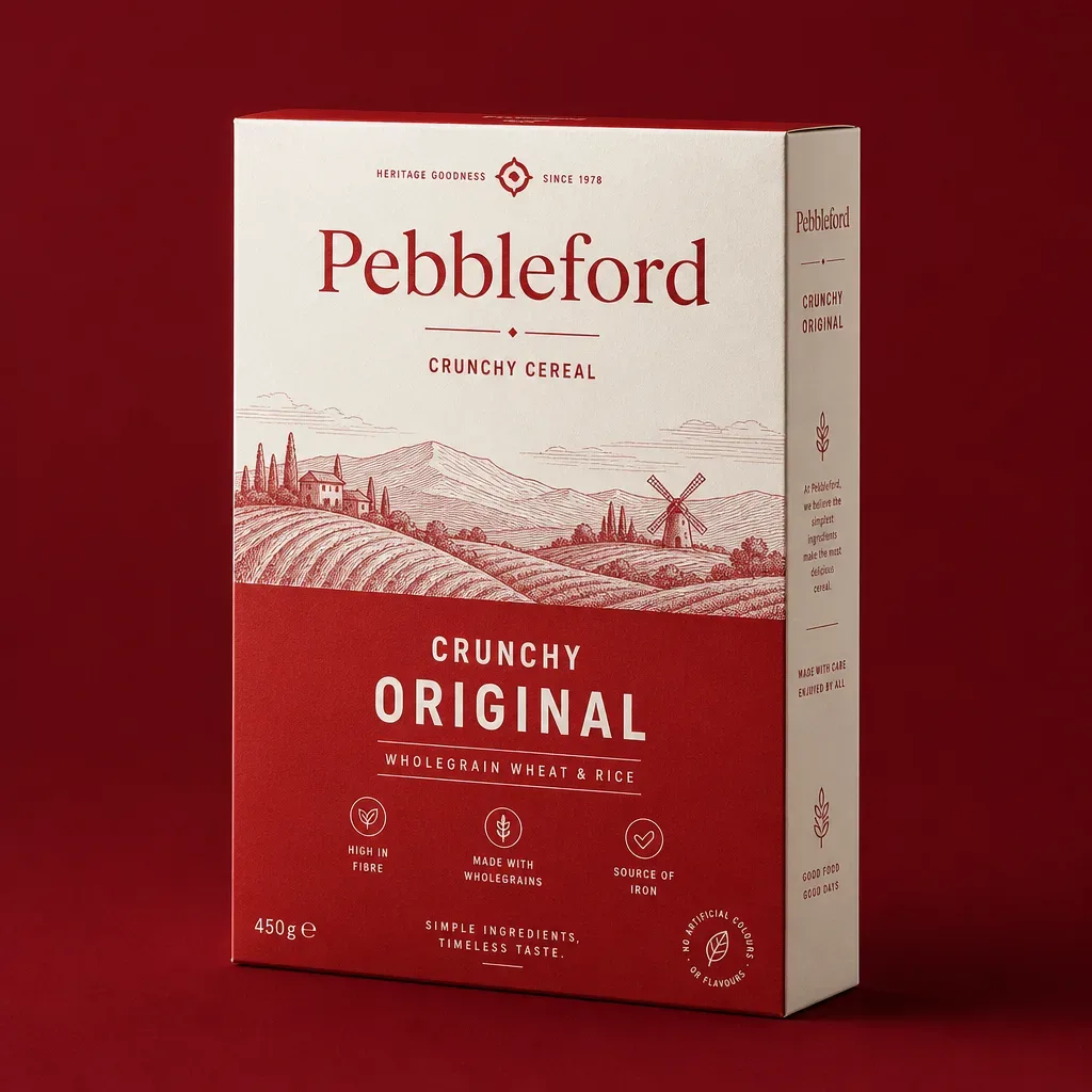
Board · print · finish
The surface does half the selling.
Board sets the print fidelity and the hand feel; the press sets the colour; the finish sets the light. Three choices, made together, decide how a cereal carton reads on shelf.
01 — Board
Start with the right board.
Select a board to see where it fits.
SBS paperboard
Bleached, clay-coated one side. The reference surface for high-fidelity retail cereal printing, with a clean white edge at any die-cut.
Print
Highest fidelity
Stiffness
High
Surface
Coated white
Best for
Retail SKUs
02 — Printing
Colour that performs on shelf.
Run length picks the press. Digital wins on short runs and versioning; offset wins on volume and Pantone consistency across reruns.
Offset
Litho printing for volume runs — the best unit cost and colour consistency across reruns.
Volume · Pantone
Digital
Plateless printing for short runs, launches and per-flavour versioning at no plate cost.
Short runs · versioning
Flexographic
Roll-fed printing used where the structure is corrugated, for shippers and multipacks.
Corrugated
Pantone / CMYK
Spot colours for exact brand match, or CMYK process for photographic front panels.
Brand colour
03 — Finishing
Finishing you can see — and feel.
A material gallery. Each finish changes shelf reflectance and scuff resistance differently.
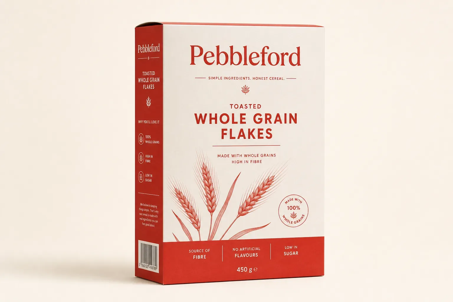 Matte lamination
Low glare across the panel; the retail default.
Gloss lamination
High contrast and saturation; makes colour pop.
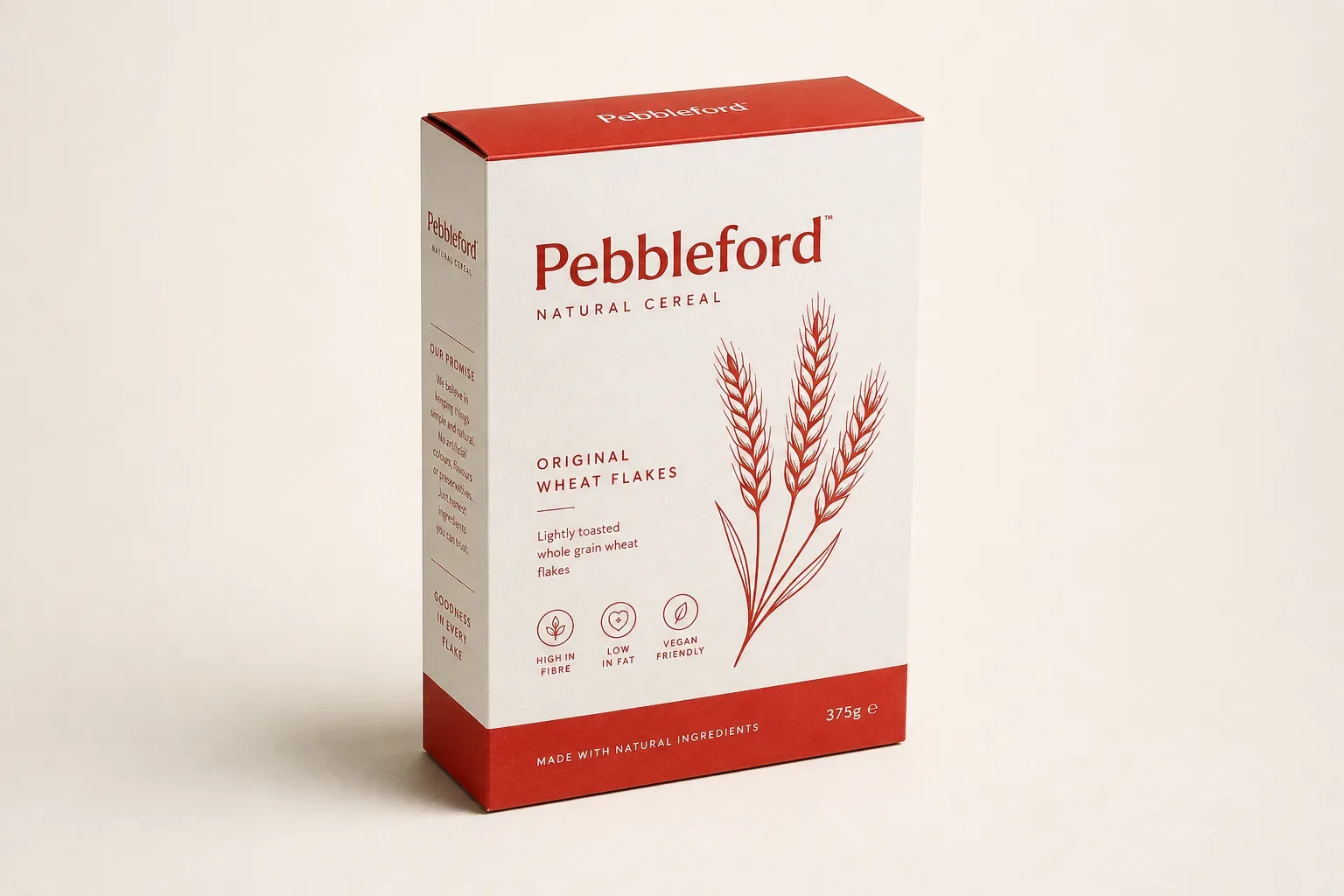 Soft touch
Velvet hand feel; reads premium instantly.
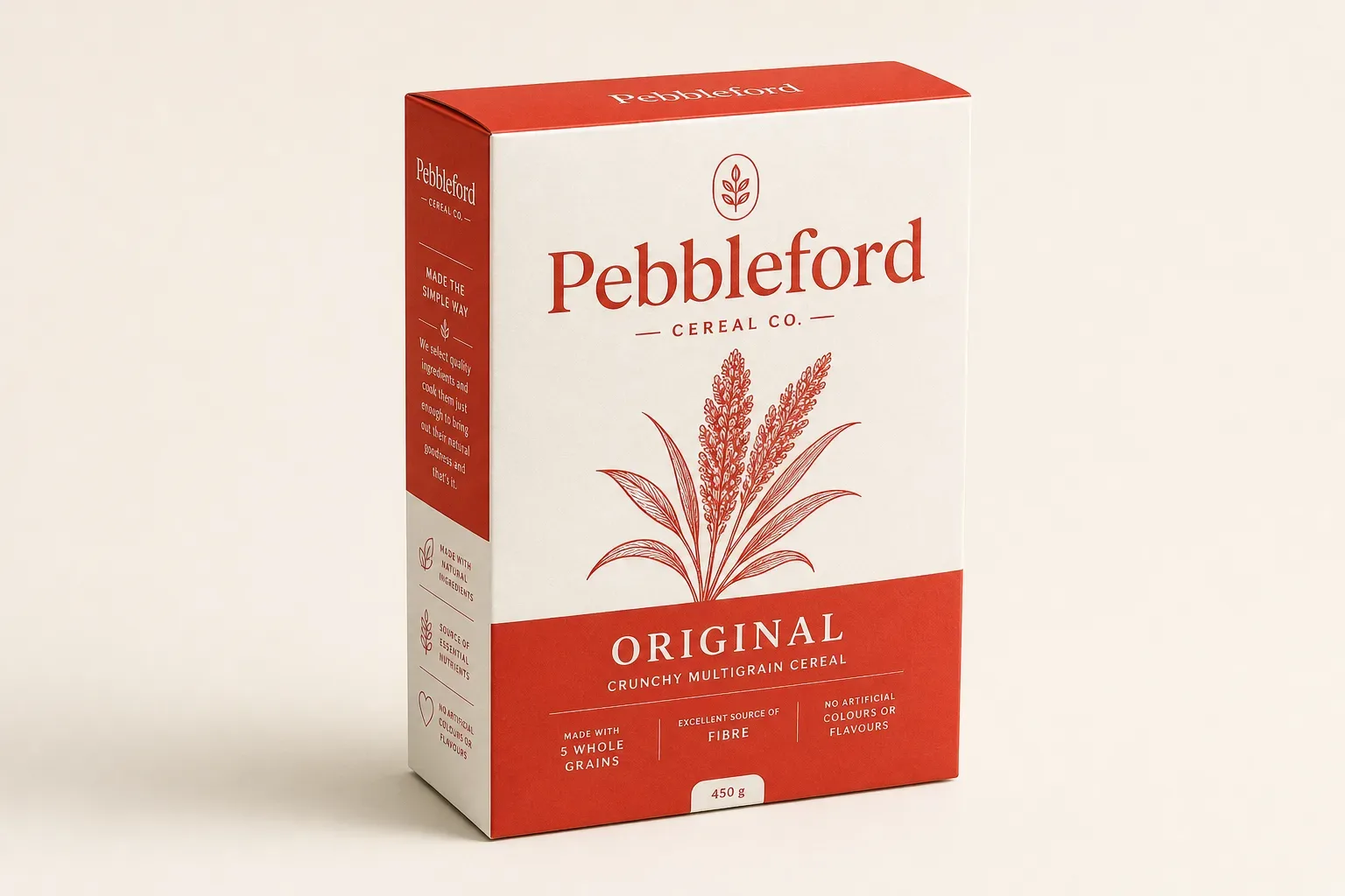 Spot UV
Selective gloss over matte on the claim block.
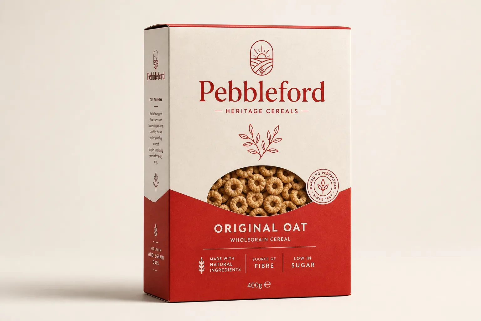 Foil stamping
Metallic wordmarks for premium tiers.
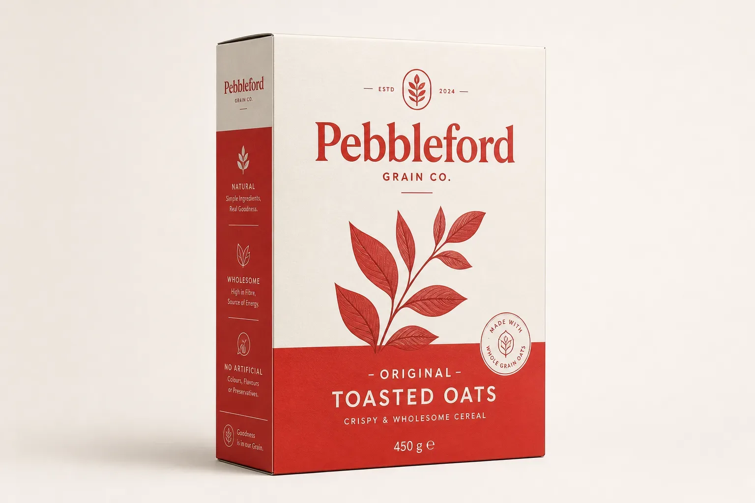 Embossing
Raised relief you feel before you read.
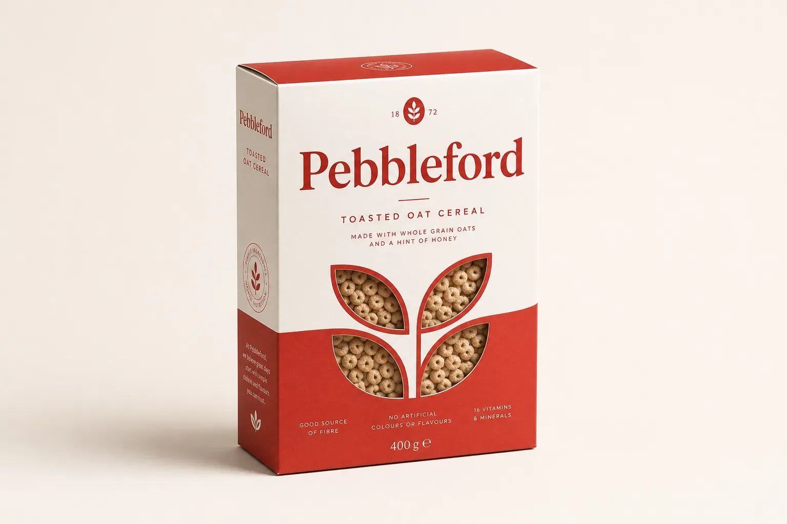 Debossing
Recessed relief; understated and tactile.
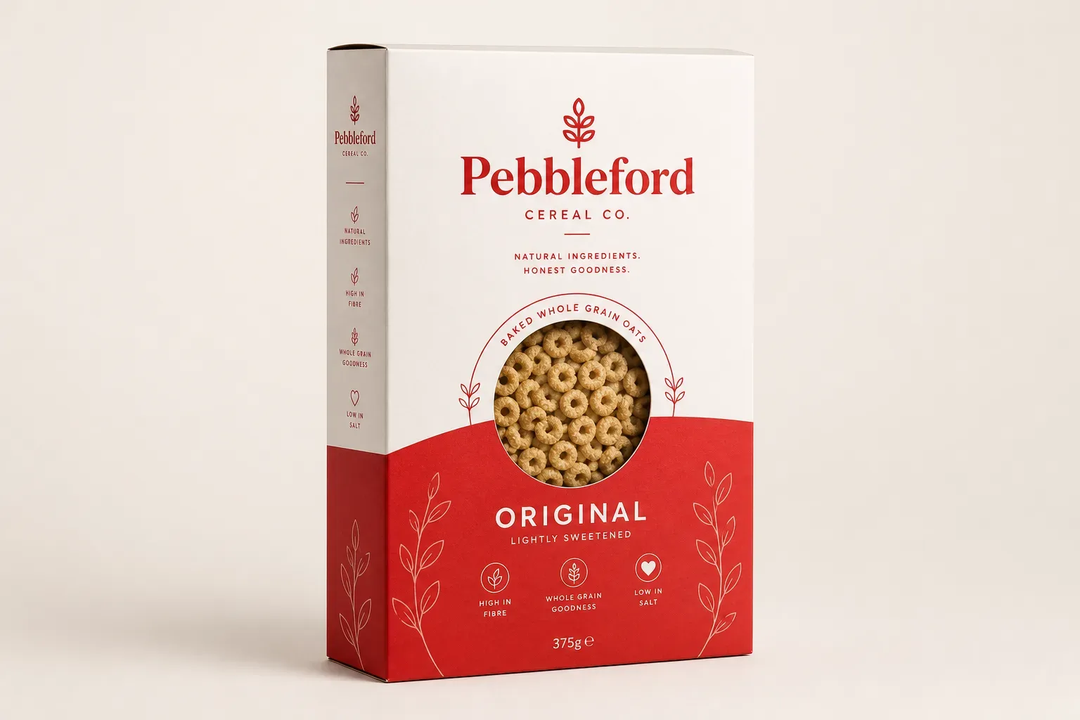 AQ coating
Fast, economical scuff protection.
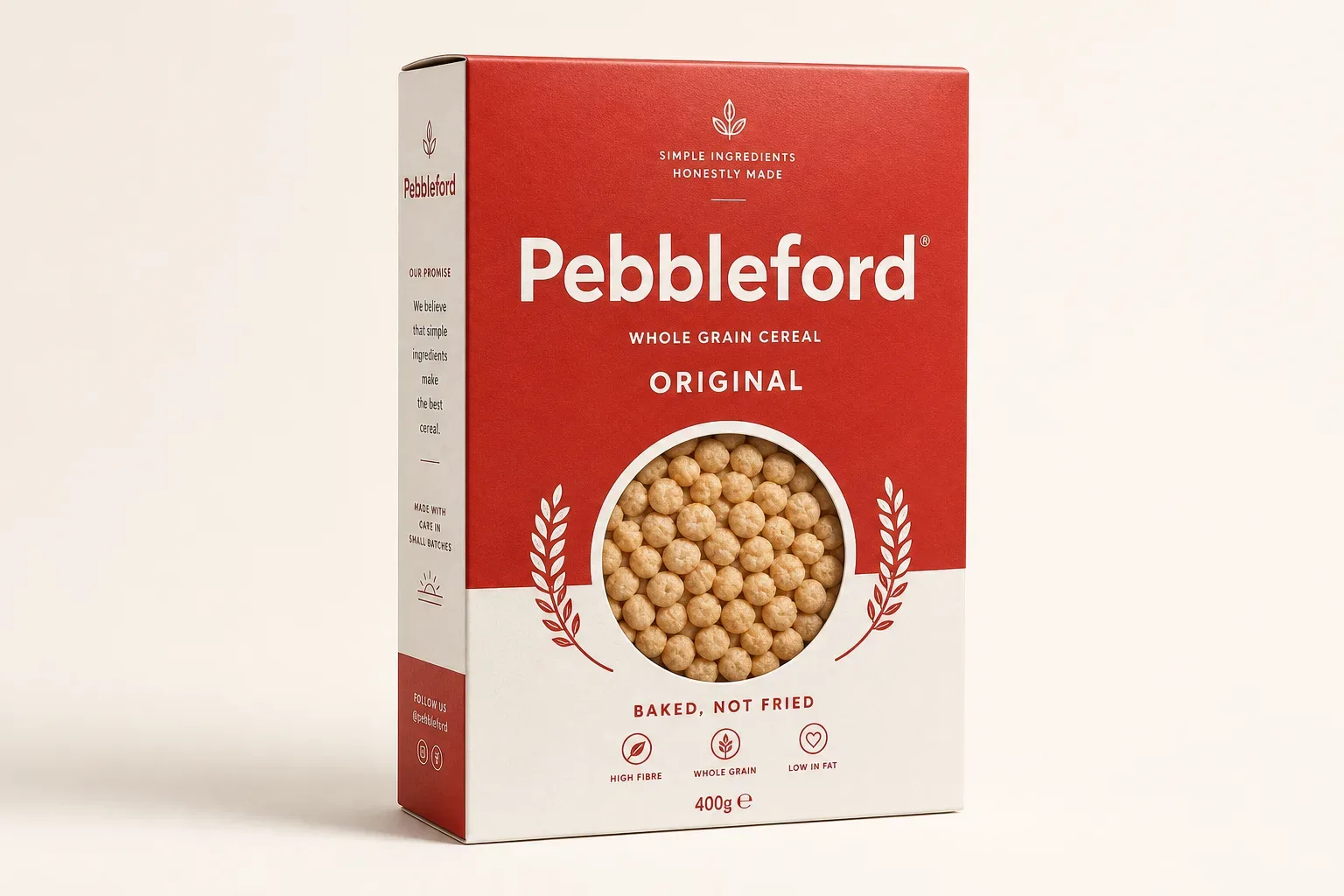 Window patching
Clear film behind a die-cut aperture.
Not sure which combination? Send us the brief.
We'll recommend board, press and finish together — matched to your run length, positioning and budget.
Start your quote →